|
The theme of this project was posters and propaganda, alongside achieving a detailed understanding of the features of colour theory and the historical development of advertisement in western countries. As for me, these topics were highly engaging, and I appreciated researching and working on them. During this project I have undertaken numerous research, starting from the invention of the colour theory and the colour wheel by Sir Isaac Newton, I constantly made more research to expand my knowledge about colours including their historical and psychological associations and colour schemes; harmonious, complementary and monochromatic. Even when I started to make my 3 posters about 3 different topics/social issues I did a range of research at the planning stage to decide how to visually present my ideas and gather the necessary information associated with the chosen concepts. Still, I feel more research could have been done as it always helps to improve and develop your work and ideas. One of the opportunities that this brief has provided us is to express ourselves through creating abstract paintings and convey our viewpoints and “changemaker” messages by producing posters. It has also allowed us to enlarge our knowledge about a topic that we sometimes take for granted; colours. I have developed many skills throughout this project such as planning (making of the posters; research, mind map, mood board, etc...), researching, writing and especially digital skills. For the first time, I have explored Adobe Photoshop to create the “protest and propaganda” posters, which I always faced as a huge challenge previously. However, this time I worked confidently and successfully and with the guidance of my tutor I ended up producing high quality work that was beyond my expectations. However, the skills that require improvement are time management, as it took me a bit longer to complete the assignment, alongside analytical skills, as I still find it slightly challenging to deeply analyse my or someone else’s work critically. My most preferred part of this project was the making of the posters. Since I like taking interest in social/political issues, therefore I also enjoyed expressing my viewpoints on them by creatively highlighting them and by making effective use of my strengths such as drawing or painting combined with Photoshop editing which, as mentioned earlier, was a new technique for so I found it challenging and fascinating at the same time. A challenge that I encountered while creating these posters was to stay in the colour scheme chosen for each one of them such as harmonious, complementary and monochromatic. However, being detailed and sophisticated I successfully overcame this challenge. By evaluating my work, I can identify that some improvements are required, in terms of analytical writing, analysing my work with the appropriate and art-related terms and vocabulary. Increasing the amount of research is another element that I need to focus on to improve my ideas and develop my work further. Therefore, improving these weaknesses is going to be my goal for the upcoming projects. ASA & CAPThe Advertising Standards Authority (ASA) is the UK’s independent regulator of advertising across all media. They apply the Advertising Codes, which are written by the Committees of Advertising Practice (CAP) https://www.asa.org.uk/ As I was making posters for charities, I needed to pay attention to the rules set out my the ASA for https://www.asa.org.uk/advice-online/promotional-marketing-charity-linked-promotions.html and for non broadcast code particularly:
This infographic, is very useful when considering advertising. 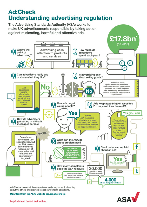
0 Comments
Poster 1 |


 | At this stage, I had used various brush types and sizes to add texture to the flat colours. I showed it to the group and received positive feedback on the concept, design and use of colours. One suggestion was to try a black background, to add contrast to the orange and blue. |
I changed the background from white to black and it worked well, especially the fire as it appeared more vibrant and the rest of the colours were well highlighted.
| The final step was to add some copy. I wanted it short and simple, to convey the message to everyone and easy to read for a wide audience. The writing was made using the text tool on Photoshop and using a clear san serif font. I used white because it contrasts with black making it easy to read from a distance. |  |
Reflection:
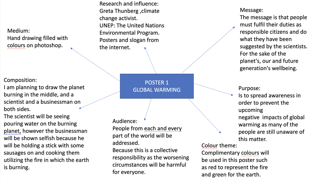
The successful areas of this poster is the chosen colours scheme: complimentary which is the reason the poster is bright and eye catching and engages the audience. I used blue as this is a traditional colour associated with money/banking and the orange is associated with change, it also worked well for the fire. The detailed concept is also a strength and the use of different brushes to add texture.
An improvement is scale the writing, it should have been bigger to fill the empty space and make it stand out. The top text could have also been in bold to grab the attention of the passer-by. I could have also used a QR code and a logo for a charity such as https://www.theclimatecoalition.org/ to promote the audience to understand the issues.
Using Photoshop was quite challenging for me as I have not used it before on my own. However, with the guidance from my tutor I have improved my digital skills and ended up producing a detailed poster, which was beyond my expectations.

Here is my final poster, in a real world view...here is would make an impact to make people stop and think about Global Warming.
Poster 2
Ideas,moodboard and inspirations
Theme: Pollution
Colour Scheme: Monochromatic
Audience: All
Use: In cities to raise awareness
Colour Scheme: Monochromatic
Audience: All
Use: In cities to raise awareness


Process
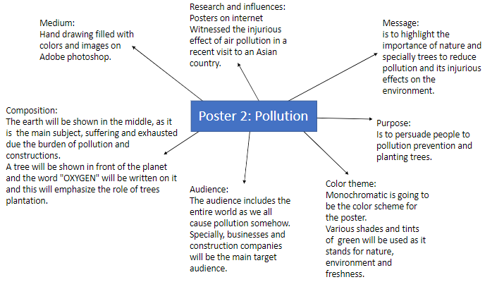
The second poster was about pollution and its effect on the environment, to highlight the importance of trees and persuade the audience to plant more trees. I wanted to use monochromatic with green-as this represents nature.
As before, I began by research on the internet to create a mood board, which helped me to be more familiar with the subject and develop ideas.
I then began by drawing on paper, initially starting with the earth, and then going back after viewing an image on the internet. I went back, drawing another earth this time adding more of the city, and transport to express pollution and text.


Once the drawing was complete, I scanned it and opened in Adobe Photoshop. As I had coloured in the last poster, through a discussion with my tutor, I decided to cut and paste found images into the poster. This is called photomontage, and I was inspired by artists such as Peter Kennard and Hannah Hoch.


 | Using photoshop I added images, taken from the internet, this process was completely new to me. However, once my tutor showed me how to start, I completed the rest on my own. To cut the images and paste them, I dragged the pictures onto Photoshop and used the lasso tool (polygonal lasso) to identify the outlines of the area that I required out of the whole picture. Once the images were cut out, they were placed wherever the drawing indicated them to be and using the Warp tool they have been bent in order to fit into. The distortional scale was influenced by Hannah Hoch |
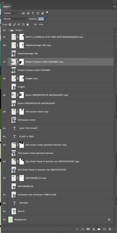 | This screenshot, shows the Layer Panel while making this poster on Adobe Photoshop. As you can see, I used a lot of layer masks and this took some getting used to, but I am very happy with my progress. |

Reflection:
The successful areas of this poster is the chosen colours scheme: monochromatic which is contemporary. I used green as this is a traditional colour associated nature. The concept is expressive, detailed and delivers the message clearly.
An improvement could have been to have taken the photographs myself, as then I could have looked for cars and buildings that were green , instead I had to search and pick every image in green colour (buildings, factories, aeroplanes, etc...). Although, I believe I could have changed these on Lightroom. Again, I could have also used a QR code to encourage the audience to understand the issues and make a change with https://plantatreeproject.com/
Again, I have greatly improved with Photoshop, the cutting out was time consuming and some of the edges are a little rough. but overall I am happy with my outcome, as are my peers were were very complimentary. The only improvement suggested was to remove the full stop, centralise the text and watch the edge of the poster as the building is too close to the top.
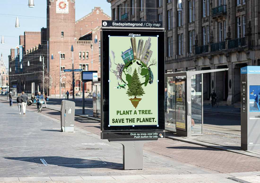
This picture shows my poster on a billboard on a street. Since I want to address everyone, I have placed the poster on a busy place where people can notice it easily and the message has a strong impact.
Poster 3
Ideas,mood board and inspirations
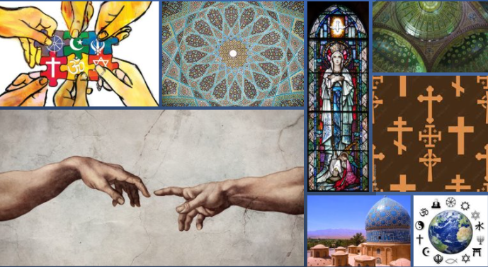
Theme: Religion
Colour Scheme: harmonious
Audience: All
Use: In public spaces of religious conflict
Colour Scheme: harmonious
Audience: All
Use: In public spaces of religious conflict

Process
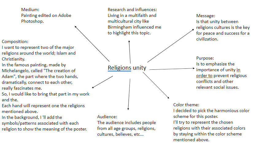
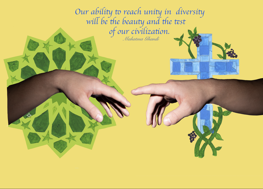
My third poster, I wanted to spread awareness about the importance and extreme need of unification in a civilization, where there are people from different background, cultures, religions, ethnicity, etc...I also want to use the harmonious colour scheme to reflect the theme of harmony with religion. I chose blue= calm, green=balance and yellow=optimism, but also for its religious meaning.
When I began planning the poster, I was a little confused about how to show my concept in a creative way and how to get started. So, I looked at religious paintings, I then saw the painting by Michelangelo "The creation of Adam", the way the two hands connects to each other, dramatically and aesthetically, fascinated me and I decided to bring that part in my own work.
Firstly, I made a hand drawing of two hands, similar to the painting and then decided to add some symbols and patterns to identify the religions that they stand for. I chose to paint the Islamic pattern in various shades of green because this colour is very significant and valuable in Islam and painted the Christian pattern in light blue because for Christian people it represents: hope, virginity and purity.
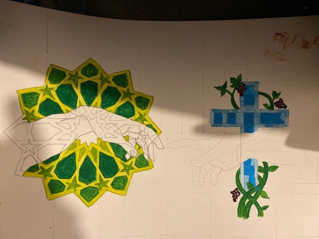
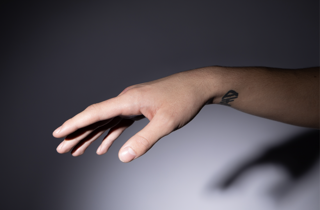
Once satisfied with the layout, I scanned the image to then edit and add colour and text in Adobe Photoshop. However, for the hands my tutor suggested I take photographs, in the studio, to create a contrast between painting and photography.
These images show the photographs taken in the studio, using a DSLR, with a zoom lens to tightly frame the hand. I used a flash with a honeycomb attachment to create high contrast and shadows. Thankful, one of my peers modelled for me. He had a tattoo on his wrist, which my tutor helped me to remove-this is too advanced PS for me. I also flipped the photo so the hands looked like they were facing each other.
 |  |
This screenshot shows my layer panel and the amount of layers used. An area to improve would be to label layers, as this makes it easily when editing.

This image shows the poster in its final phase, when I was colouring the background after adding the text and the photographs of the hands.

Reflection:
The success of the poster is its peaceful vibes due to the colour combination and the light shade of yellow in the background as this colour stands for happiness and optimism. The quote delivers the message clearly, convincing and inspiring.
An improvement would be to increase the size of the drawings to fill the image, or crop the poster so that the hand on the left meets the end. I also might add a texture to the background, as I don't like the plainness.
During this process the thing that I found hard to do, on Photoshop was to bend the hands in order to fit them in the image onto the designated place. Also, to have a neat looking outcome I had to erase the unnecessary lines in the background and for that the key thing was to identify and select the right layer.
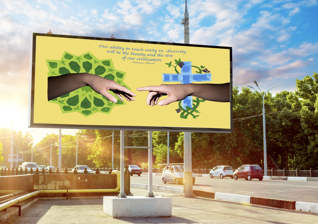
This image shows my third poster on a billboard where it can be, easily, visible for the target audience.
| 1886 Coca Cola was invented by a pharmacist called John Doc Phemberton, in the 1886. First, it was used as a medicine but turned to be a soft drink later on. It's first name was Fresh Wine Coca and was a mixture of coca, kola, lime, vanilla, nutmeg, and other ingredients. In 1886, the Jacob's Pharmacy, served it for the very first time for the cost of 5 cent. One of Coca-Cola's earliest print ads included the slogan "refreshing and invigorating" as well as the original price for a glass: 5 cents. This first ad, clearly uses the logo to identify the brand, which is one of the most recognised world wide today. | 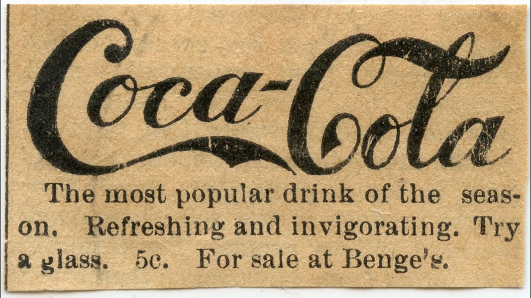 |
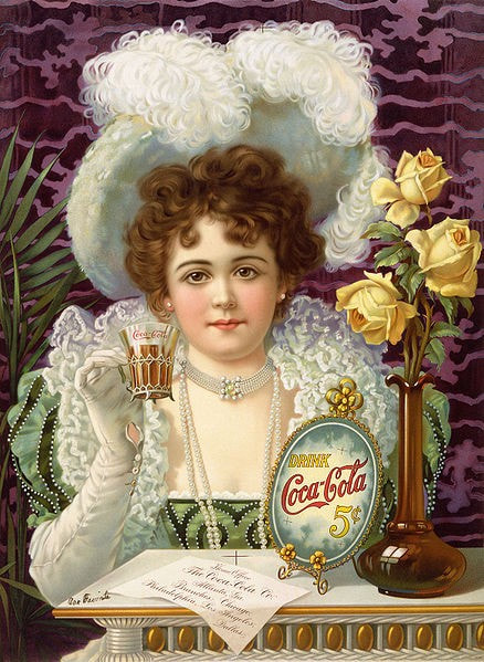 | 1890s Hilda Clark was the first celebrity to be used in Coca Cola adverts. The style is typical of the era, using illustration and bold colours to make an impact. The outfit she is wearing highlights the fashion of the time and the culture she represents creating a wealthy and regal-the colour purple and use of gold. The paper on the table shows the location of the Home office and all the branches of the company, which is a smart way to address. As is the price of Coca Cola within a decorative frame. This advert is clearly targeting the female, upper-class market to entice the viewer to buy the product. This would have been rare, as women were rarely allowed to drink in public without male company-showing a change in society. |
| 1910s This advert continues to use illustration and yet this time it uses a harmonious colour scheme which is pleasing to a wide target audience. Again using the celebrity endorsement with the Baseball player Rube Waddell. The key element of this advert is the description at the bottom which is highly convincing and includes a dialogue said by one of the baseball player: "I drink Coca Cola regularly and have been doing so for years. It is the best, most refreshing beverage an athlete can drink". This is a very smart strategy to deliver the message and promote the product through out a celebrity or a person who is followed and idealised by many. At this time, leisure activities were becoming more popular with the middle classes and this would attract the buyer. |  |
 | 1920s This advert created a barrier between rich and poor people in society by producing status conscious ads. This decade is called the "Roaring Twenties", since in this period the western nations saw rapid industrial and economic growth, accelerated consumer demand, and introduced significant new trends in lifestyle and culture. Coca Cola kept its traditional elements such as people and bright colour but instead of descriptive and long text it introduced exciting and fascinating short slogans; "Delicious and Refreshing". This advert's composition is a clever way to emphasize the importance of the product by increasing its size respective to the person's size. The woman's facial expressions as well as the her body posture shows how fascinated and attracted she is by the glass of Coca Cola. |
| 1930s Coca Cola began using Santa Claus in its adverts to promote the drink from the 1920's, but he was quite stern and in the 1930's artist Haddon Sundbloom created a friendly, happy picture of Santa holding a Coca Cola drink for the “Thirst Knows No Season” campaign, with the aim to persuade people that Coke is not a drink limited for a refreshing break for the summer heat. Santa Claus matched perfectly with their sense of respect for the past and family traditions which is why the link between Christmas holidays and Coca-Cola was a great success. The line outside the bottle of Coke are outshining it and making it desirable. Also, the Santa's satisfaction and pride, shown on his face, helps to deliver the message wanted by the company. Along with the tradition red and green sinuous with Christmas traditions. |  |
 | 1940s The 1940s were known as "the war years", due to World War II and were associated with sorrow, patriotism, hope and after the war had ended, the begging of a new era. This advert portrays the soldier in a foreign country, delighted by the nostalgia and comfort of the Coca Cola poster, with the persuasive tag line "My old friend Coke". The red is eye catchy and stands out from the harmonious greens and blue, to well highlight the product. The slogan remains the same: "Delicious and Refreshing", which is a suitable one for a person who comes after a long journey, as the soldiers are. |
| 1950s This was a decade of growing economy, after the war years. All sectors witness a "boom"; a booming economy, a booming suburbs and the baby boom (about 4 millions babies per year). Although there were still issues in society with class and race. Coca Cola broke the norm, by using a family of colour to advertise the product, showing a positive change. The family appear to by watching tv, the colours used are harmonious which give it a relaxed and comforting appeal tot the audience. The tag line "Sign of Good Taste", and red logo dominates the advert and photography has been used. | 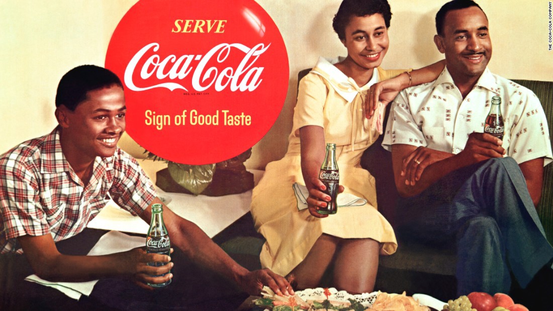 |
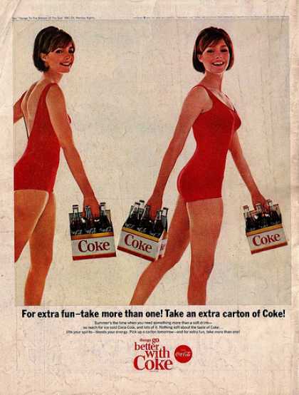 | 1960s The 1960s were a time of social, civil right movements, protests and female equality. Although this is not portrayed in this advert from 1965. The use of the women in her swimsuit to sell coke sexualises the brand, something many advertising companies used in this era and the next. The photo dominates the advert, with a some copy and a tag line to reinforce that by drinking coke you will have more fun! Again the colour red, is used throughout to reinforce the brand. |
| 1970s In this advert, for TV and print. Coca Cola used equality and peace as a theme, in response to the war in Vietnam. This adverts uses stills from the advert, with people from different backgrounds and faith united to deliver a message of peace and unity. The caption; "I'd like to buy the world a Coke", identify the drink as a symbol of peace and acceptance for each other. Through this advert it shows that the adverting agencies used social issues and spreading awareness in the society through their ads | 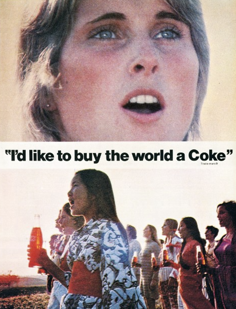 |
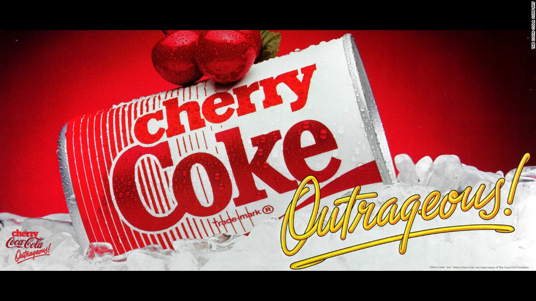 | 1980s The 1980s was considered to be a decade of new discoveries, new trends and styles. Pop culture was an introduction of the 80's alongside chunky cellphones, computers and the end of comic books. Coca Cola, introduced a variety to its products such the Cherry Coke. This simple advert used the tagline "Outrageous" which reinforced the tv advert. This fun commercial combined all pop culture of the era: MTV, Footloose, aerobics, neon and bubblegum colours. This helped persuade a new younger audience to the brand. |
1990s
The 1990s was a decade of peace and welfare. Technology, art, music and economy, were all succeeding.
The Diet Coke Break advert campaign is a series of six for tv from 1994 to 2013, to promote the soft drink Diet Coke. Each advert centres around a group of women peering at an attractive man while he works, with the music "I Just Want to Make Love to You".
The Diet Coke Break campaign is an early examples of gender roles being swapped in TV advertising, with women objectifying attractive men, rather than the other way around. The campaign has also generated criticism over whether its adverts are sexist towards men, which is quite ironic when you consider how women have been used to sell products.
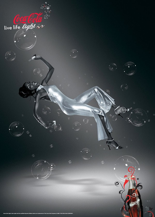 | 2000s 2000s marks the beginning of a new millennium, however its first decade was politically complicated, in particular for America due to the 9/11 attack on the Twin Tower. While the world was changing with the invention of new technologies, Coca Cola also introduced varieties in its product such as Coca Cola light. This digitally enhanced photograph, enables the model to seem floating, along with the monochromatic scheme, not only gives the feel of space but also allows the red to stand out. |
| 2010s 2010s was a decade of countless discoveries and inventions in terms of technology, people took more interest in social issues and mainly the impact of social media in people's lives. Coca Cola, also, made changes in its advertising style; the composition of the advert, colour palette, presentation of the product, etc...This ad shows that the product is well presented, with all the varieties alongside the relative nutritional facts, which was not visible previously. There is a short description that inform and persuade the consumer about the different options to choose among Coca Cola, Coca Cola Life, Coca Cola Zero and Coca Diet Coke. This is important as the consumer has been rights and needs to be aware what is purchasing. However, one element that Coca Cola has kept one is the the exaggerated happiness shown by the people in the advert, when drinking the product. | 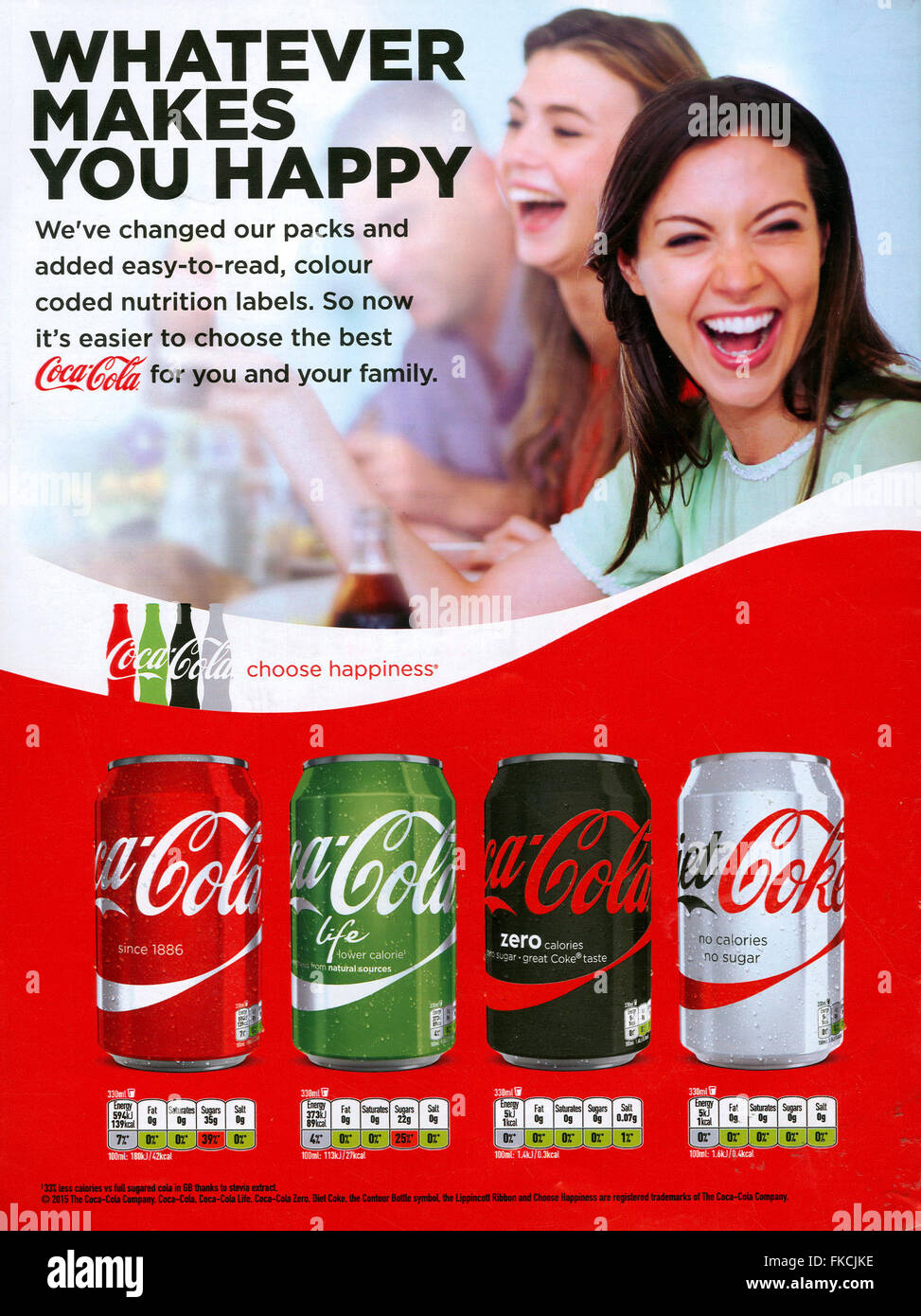 |
references
https://medium.com/swlh/coca-cola-ads-and-the-evolution-of-creativity-in-advertising-b0655b3da780
https://blog.retroplanet.com/coca-cola-slogans/
https://www.campaignlive.co.uk/article/coca-cola-christmas-30s/1108708
https://www.thoughtco.com/1940s-timeline-1779951
https://www.history.com/topics/cold-war/1950s
https://www.rediscoverthe80s.com/2021/12/everything-you-need-to-know-about-80s-pop-culture.html
Colour theory is an art and science about the use of colours.
It's role is to explain how humans interpret colours and the outcome that we achieve by mixing, matching and contrasting them.
The theory is divided in 3 major categories: colour wheel, colour values and colour scheme.
It's role is to explain how humans interpret colours and the outcome that we achieve by mixing, matching and contrasting them.
The theory is divided in 3 major categories: colour wheel, colour values and colour scheme.

Colour wheel
 | The colour wheel is a circular shape divided in 12 sections, where every section shows a different colour starting from the 3 primary colours (red, blue and yellow),the ones that can't be produced by mixing any other colour. After these three colours, there are the secondary colours which are produced mixing two primary colours together and the last ones are the tertiary colours, achieved mixing one primary colour with one secondary colour. |
Primary colours: red, yellow & blue
Secondary colours: orange, green & purple
Tertiary colours: Red-Orange, Yellow-Orange, Yellow-Green, Blue-Green, Blue-purple, Red-purple, which are formed by mixing a primary with a secondary.
Secondary colours: orange, green & purple
Tertiary colours: Red-Orange, Yellow-Orange, Yellow-Green, Blue-Green, Blue-purple, Red-purple, which are formed by mixing a primary with a secondary.
Colour wheel history
 | The colour wheel was invented by Sir Isaac Newton in the 17th century. In a dark room, Newton placed a prism in front of a beam of light and created a spectrum of colours from red to purple. Through out this experiment he concluded that white light is built of many colours. In 1704, in the book called Optiks, Newton presented an early colour wheel according to the combinations he discovered through his prism experiment. |
| Monochromatic colours : The word Monochromatic comes from greek language; mono: one and chrome: colour. Monochromatic colours are the different shades, lighter and darker, of one single colour. An example is shown on the right side ,where we can see the various shades and tints of the colour blue. | 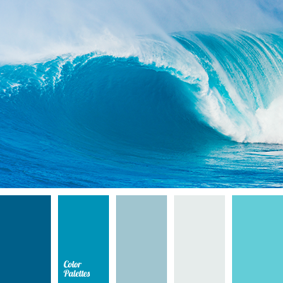 |
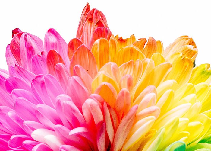 | Harmonious colours: Harmonious colours, also called analogous colours and are placed next to each other on the colour wheel. When composed together, harmonious colours, are very eye catching like the example shown on the left side. |
| Complementary colours: Complimentary colours are found opposite each other on the colour wheel. When combined together they produce a strong contrast and standout. |  |
Psychological theories and historical associations
Red
|
Historically, the colour red was considered as a sign of sacrifice, danger, revolution and blood.
In the medieval times, the fighting ships used to have red flags to suggest of a fight to death, however, during the French Revolution, the Jacobins political group used a red flag to honour their martyrs' blood and the colour became their official symbol. The colour red has been used for the flags of several political parties, movements and organisations such as Soviet Union, communist China and from 1906 The British Labour party. Today, red is the symbol of fire, love, passion, danger, anger, health, etc... |
|
Orange
|
The colour orange is very important for several cultures and religions, specially in Asia. Many holy people, in India and China, wear orange garments, which highlights its religious importance in these areas.
In Buddhism, orange is connected to perfection and the highest stage of illumination, it is also associated with fertility and greatness. In Roman mythology, the god of abundance was always shown in orange. In British art, orange was introduced by the Pre-Raphaelites, a group of English painters, poets and critics, founded in 1848. Today, orange stands for joy, warmth, heat, sunshine, enthusiasm, creativity, success, encouragement, etc... |
|
Yellow
|
Yellow is one of the oldest colours used by many civilizations, cultures and religions.
In ancient Egypt, the bodies of the gods were painted in yellow to resemble gold to highlight their importance and the pigment was produced from clay soil rich in ochre as early as 45,000BCE. However, in the 14th century, people started to consider yellow as the sign of jealousy, lying, dishonour and treason. From the 1941, when the Nazi party was in power in Germany, the Jews were forced to wear the yellow star of David to identify them. Currently, the main cyclists, in the Tour de France, wear yellow shirts because the race’s sponsor was L’Auto newspaper, printed on yellow paper. Today, the colour yellow is associated with warmth, sunshine, happiness and positivity. |
|
Blue
|
Blue is one of the inventions of the ancient Egypt, where it was considered to be the colour of fertility, birth, rebirth, life and heaven. It was made by combining copper and iron with silica and calcium.
Greek and Romans didn't have a name of this colour but still existed and used for clothing, however the Barbaric Celts used to dye their bodies blue before a battle . During the Medieval times, blue dye was produced from woad (a flowering plant found in the Mediterranean) which made the dye extremely expensive; the reason why blue had been associated with nobility at that time. Blue was not only an expensive dye but an expensive pigments to. In the Renaissance painting the Virgin Mary was always depicted in blue which made the colour a symbol of purity, humility and divine. Blue is present in the Chinese culture, as well, where the white and blue porcelain are one of the recognition of China. Many of these beautiful pieces mix Chinese porcelain techniques with Islamic motifs. Blue, is also, one of the important colours in Islam; it stands for divine and the hereafter and it is widely visible in the mosque such as the Blue mosque in Turkey. Today, the colour is a sign of calm, trust and intelligence. |
|
Purple
|
Purple has been considered a symbol of power, wealth and royalty for centuries. It was only wore and affordable for the upper class and it is said that Queen Elizabeth I forbad anyone except close members of the royal family to wear it.
Initially, it was produced from a small mollusk that was only found in the Tyre region of the Mediterranean Sea and it represented spirituality and holiness because it was mostly wore by the emperors, kings and queens which at in the ancient time were considered to be gods or descendants of the gods. Today, purple is associated to wealth, luxury, creativity, wisdom, dignity, peace, pride, magic, etc... |
|
Green
|
Green pigment was ,originally,produced in the ancient Egypt using the copper mineral malachite to paint the tomb walls. But they noticed that it used to turn black over the time.
The ancient romans,tried to solve the problem and experimented to to soak copper plates in wine to create verdigris, a green pigment that comes after weathering the metal. Historically, this colour represented regeneration and rebirth. In Islam, the colour green is highly important and sacred.It stands for immortality and believed to be the Prophet Muhammad's favourite colour. In the Bible, green is associated with vegetation, symbolizes life, restoration, and new beginnings. Nowdays, green means vitality, freshness, growth, nature, environment, wealth, balance, health, & youthfulness. |
|
Black
|
Black is one of the oldest colours, even prehistoric artist used to have black pigments produced from charcoal and iron minerals.
The Greeks had used black to paint silhouettes on clay pottery, making them the first signed pieces of art in history. Black is associated with cruelty and devil, in Latin and later on, in the Medieval paintings, the devil is seen to be painted in Black. The first book in the world, Gutenberg Bible, was printed in black ink on white background because the contrast between these was the easiest one to read. Today, black stands for; darkness, evil, sophistication, elegance, power, mystery |
|
White
|
Technically black and white are not colours, they're shades.
White has represented purity for many cultures and beliefs. It has been wore by priest, religious people and the first class of the society in Ancient Egypt and Rome and the temples, in that period, were made with white marble. The Pope has worn white since 1566, as a sign of purity and sacrifice. In the Islamic world, the colour white has a great importance and it is worn by the preachers, maulanas and by men in everyday life. However, in China, Korea and many other Asian cultures white represents bad luck, mourning and death and it is traditionally worn at funerals. Today, in the western cultures the colour white is associated with weddings, hospital and angels. Black when composed with white it is a symbol of the eternal struggle between day and night, good and evil, and right and wrong. |
|
Abstract painting
| | I made this abstract painting in class and the purpose to create it was to express myself through out colours. I put the white paint in the background because this colour, according to me, represents my soul and my spiritual personality. On top of the previous one, I put the light blue paint which stands for my dreams and desires, however the dark shade of yellow shows the challenges that I have to face on a day to day basis or in the way to achieve something. The last colour is red which I would describe as my happiness and satisfaction which I feel following an achievement, whether it is small or big, after helping someone or by doing my hobbies. |
References
https://99designs.co.uk/blog/tips/the-7-step-guide-to-understanding-color-theory/
https://thevirtualinstructor.com/Color.html
https://www.webopedia.com/definitions/color-wheel/
https://www.vectornator.io/blog/monochromatic-colors
https://en.wikipedia.org/wiki/Complementary_colors
https://www.historyextra.com/period/a-history-of-colour/
https://mymodernmet.com/history-color-orange/
https://www.theguardian.com/books/2019/dec/24/yellow-the-history-of-a-colour-by-michel-pastoureau-review
https://mymodernmet.com/shades-of-blue-color-history/
https://www.worldhistory.org/article/999/color-in-ancient-egypt/
https://artsandculture.google.com/story/the-secret-history-of-the-color-blue/bgIyIXzv_RULIA
https://artsandculture.google.com/story/the-secret-history-of-the-color-black/fwISZyrkPUt0IA
https://www.buzzwordcreative.co.uk/blog/colour-semiotics-and-what-they-mean-in-other-cultures/
 RSS Feed
